
UI designers are always looking for new ways to do common tasks better and faster. This new style of filling in forms may prove to be one of those new twists that makes people think, “Why didn’t I think of that?”
Luke Wroblewski writes about some new websites that lay out registration forms in a narrative format rather than a standard grid format. Here’s an example:
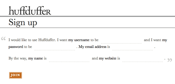
A/B user testing showed that the narrative style form increased conversion rates by 25-40%. This new style goes against conventional UI guidelines of trying to lay out forms to enhance scanning vs. reading. This new style follows the reading style, which may prove better for common registration forms that ask information such as, “Who are you, what’s your e-mail address, where do you live, etc.?”
It is too early to see who wins this contest, but it is refreshhing to see new, innovative ideas in UI design!
WHAT DO YOU THINK?
<< View Luke W’s blog >>